The new Nore Vision logo, created with the help of the river itself
The river essentially is organic, fluid, creates its own form and shape and, of course, is made from water. We wanted our logo to have the same qualities.
When we came to design a new logo for Nore Vision – Nore River Catchment Trust, designer Bill Hollingsworth felt the river Nore should play a central part. The river essentially is organic, fluid, creates its own form and shape and, of course, is made from water. We wanted our logo roundel to have the same qualities.
Because the highest visibility for the mark would be online, it would need to fit within the circular confines of a social media avatar. We asked artist Michelle McMahon to help.
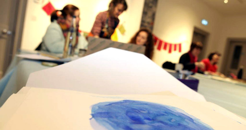
Using Nore River water we would create a design in watercolour which would be: Organic (made by a human being rather than a machine), Fluid (not regular, not structured, multi-layered, at different levels both transparent and opaque), Self-creating (using the guiding hand of the artist, allow the colours to take their own form, to bleed into each other and to overlap in layers as the medium takes defines), Made from water (using actual Nore water in a watercolour roundel).
Michelle worked with a group of women and almost a dozen roundel designs were painted, from which we chose one. We are delighted with the result, delighted that the river itself played its part and feel it reflects the qualities we hoped for.


